One design system for developers across state agencies.
Developers across state agencies needed one shared library. I helped lay its foundation by turning the design team’s work into CSS, and today I review its code and help agency teams adopt it.
At a glance
Context
A statewide design system for teams building public and internal applications on different technology stacks.
My contribution
Built the original CSS library from the design team’s work. Today: code review for the core and documentation repositories, Angular support, and adoption help for agency teams.
Why it mattered
With the system in place, agency teams turn new pages and components around quickly.
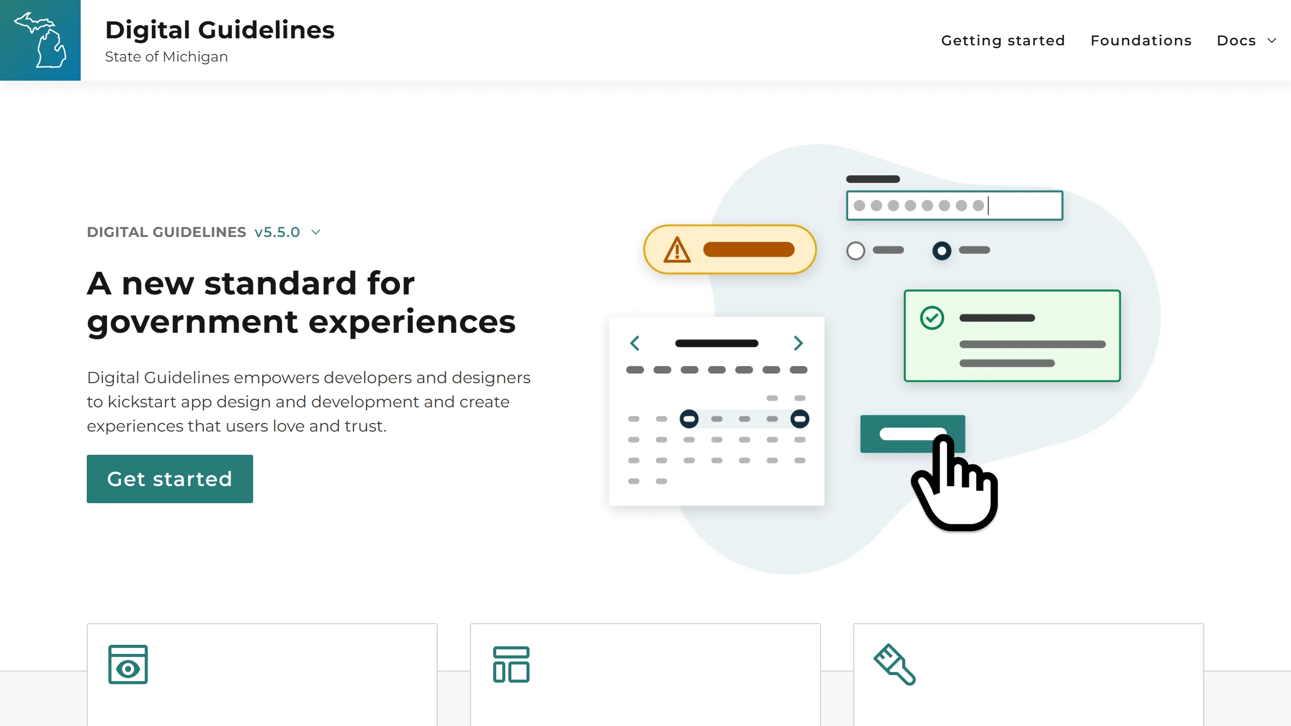
digitalguidelines.michigan.gov
The public Digital Guidelines site today. Source: digitalguidelines.michigan.gov
On this page
How my role changed
Early versions of the library were CSS only. As it grew into web components, my focus moved to code review and to helping agency teams adopt it: answering their questions, reviewing their builds, and sketching wireframes from the designer’s work.
Adapted the original CSS foundation to State of Michigan design values and colors, with shared Sass mixins, functions, and maps.
Review code for the core library and documentation repositories.
Support Angular teams integrating the library into existing applications.
Work with agency development teams on implementation, including wireframes from the designer’s work.
Worked on the documentation website using the library it explains.
System decisions
Across stacks
Standard web components and framework guidance share one language without requiring one technology.
Clear spacing
Spacing follows a 4px grid on a 16px (1rem) base, so values stay predictable and easy to discuss.
Practical documentation
The documentation site is built with the library itself, so its guidance and components are tested with real content.
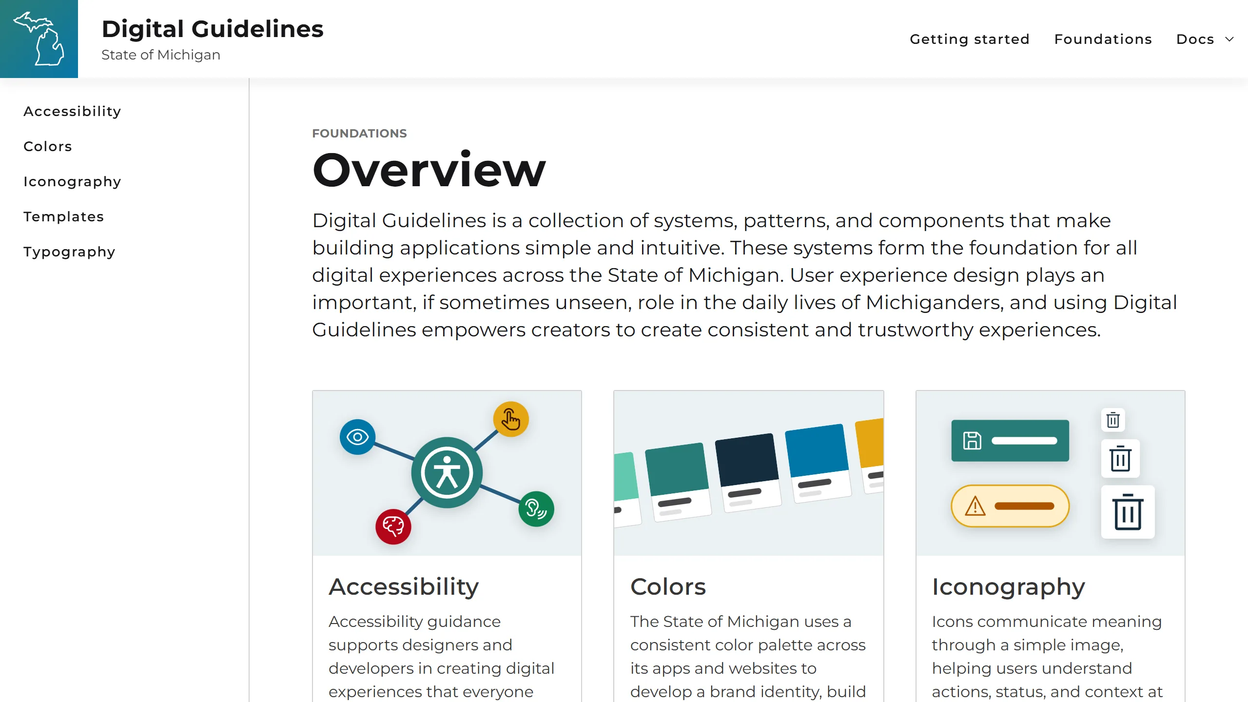
digitalguidelines.michigan.gov/docs/foundations
The Foundations overview in the documentation site. Source: digitalguidelines.michigan.gov/docs/foundations
Accessibility built into components
Shared foundations bring focus behavior, semantics, keyboard interaction, contrast, and assistive-technology considerations closer to implementation. Teams still own the accessibility of their content and complete applications; components such as som-input take on the repeated work.
Sometimes the accessible choice is to build less. Our custom calendar was hard to make accessible, so we moved to recommending the native date input instead.
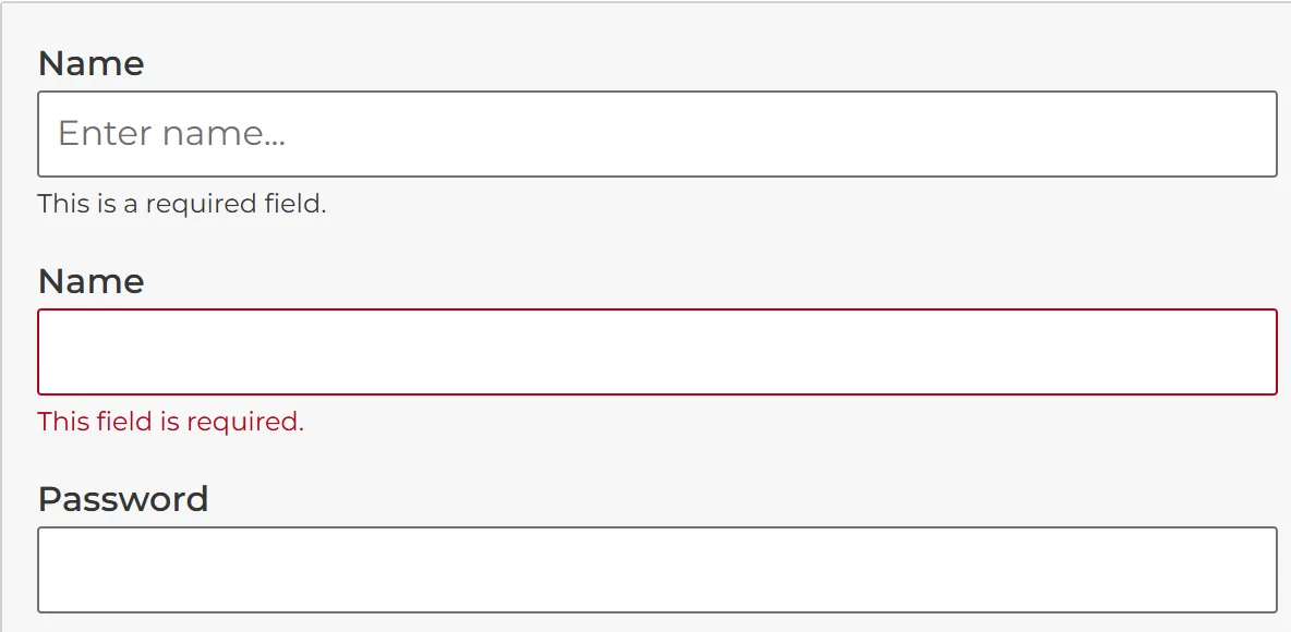
The som-input example: helper text, and the same field in its error state. Source: digitalguidelines.michigan.gov/docs/components/forms/som-input
Decision evidence
Keep validation feedback connected
Design intent
Help people understand what a field needs, what went wrong, and what to do next without relying on color alone.
Implementation decision
Maintain the relationships among the label, supporting description, active error, and the input’s changing ARIA state.
Experience protected
Visual and assistive-technology feedback stay aligned through every validation state.
The public library today
The public library provides foundations, a Figma design kit, reusable components, implementation paths for multiple stacks, release notes, and support guidance. Teams use it as a shared starting point and build on it.
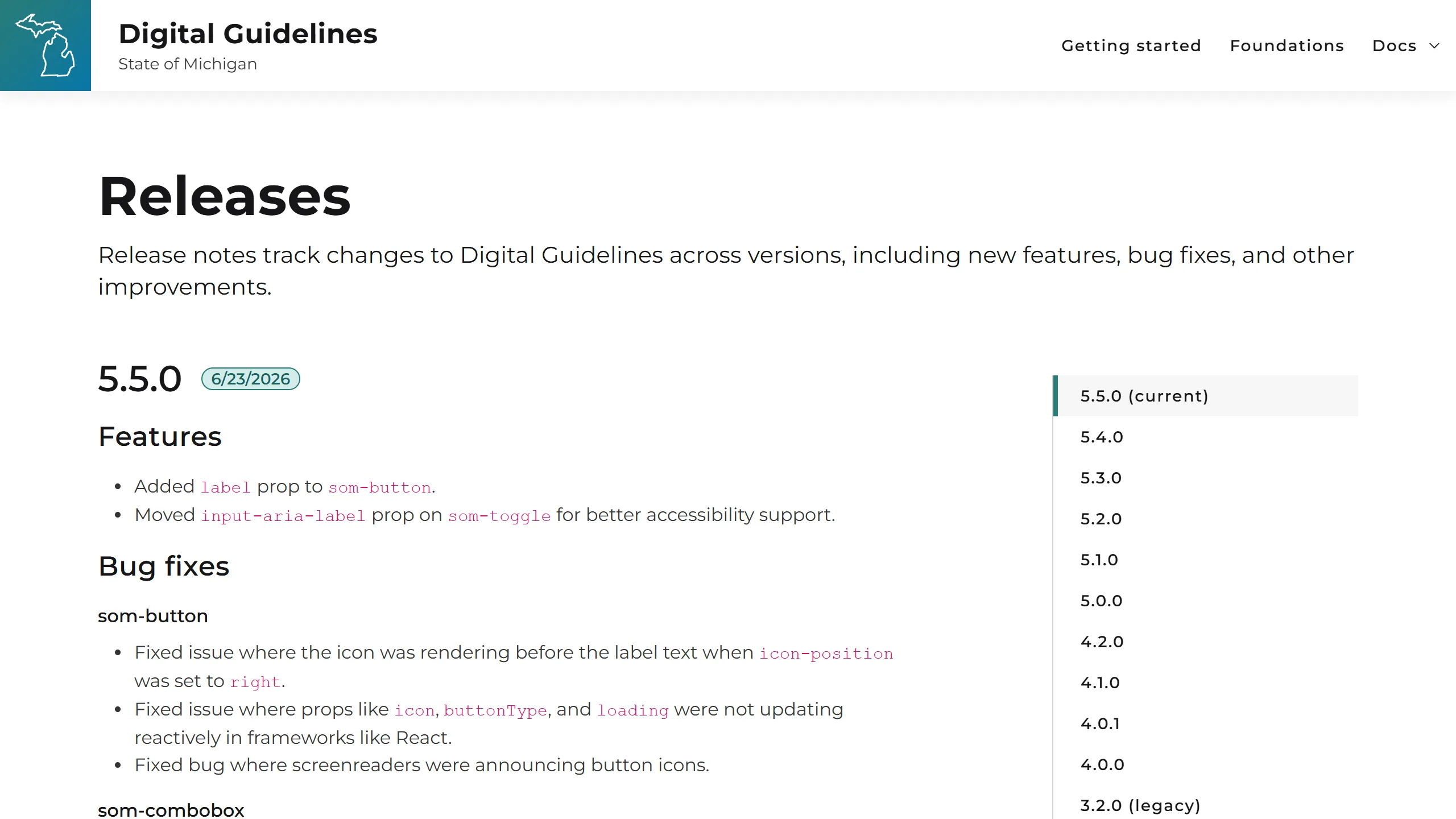
digitalguidelines.michigan.gov/releases
Public release notes for each version of the library. Source: digitalguidelines.michigan.gov/releases